Brand Guide
These resources and guidelines are designed to help you apply Hexinox's visual brand effectively and consistently.
Wordmark
Our logos are distinct, bold, and give focus to our company name and offerings. Please use them as directed and choose only the files appropriate for your intended application.



Usage Guidelines:
- Color version should be used wherever possible, except when use of color is limited by production or sufficient contrast cannot be achieved.
- White version should be used when background is dark, and sufficient contrast exist.
- Black version should be used only if color cannot be used, and the background is white.



Colors
Our primary palette includes teal, black, and white. Purposeful use of these colors creates consistency across our brand experience and reinforces trust and familiarity. These colors are additionally used across marketing and product to lead users to CTAs, create negative space, and designate focal points for our visuals.
Primary
- HEX: #103f45
- RGB: 16, 63, 69
- CYMK: 77%, 9%, 0%, 73%
Black
- HEX: #000000
- RGB: 0, 0, 0
- CYMK: 0, 0, 0, 100
White
- HEX: #ffffff
- RGB: 255, 255, 255
- CYMK: 0, 0, 0, 0
Forbidden Usage
Do not stretch

Do not apply filters
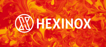
Do not place over busy backgrounds

Do not change color

Do not rotate
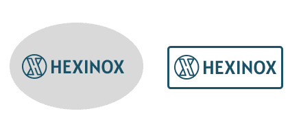
Do not place inside a shape or container
